

Submitted by Charles Hugh Smith from Of Two Minds
The One Chart That Shows Where AAPL and the Market Are Heading
Is Apple going to $1,000 per share and dragging the market higher with it?
Sometimes one chart tells us more than a thicket of charts. Every analyst and punter seeks an "edge" by plotting and comparing innumerable indicators, ratios, correlations and data points. Sometimes all this complexity pays dividends, but if it did so consistently then 90% of hedge funds and mutual funds wouldn't be underperforming index funds. Sometimes a single chart says it all.
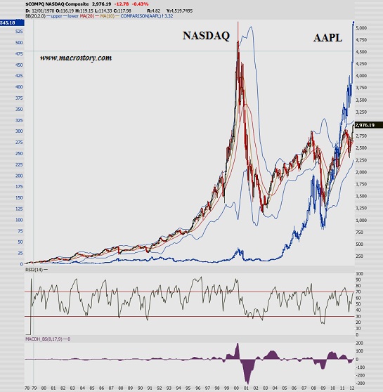
Chart courtesy of the Macro Story.
Any questions?
Yes. Doesn't this mean that AAPL (Apple) is on its way to $1,000 per share based on iPad 3 sales, and with strong growth in GDP and corporate profits, the Dow Jones Industrials are going to 15,000 and the S&P 500 is heading for 1,500?
Answer: If that's what you see in this chart, then that's what the chart means to you.
The One Chart That Shows Where AAPL and the Market Are Heading
Is Apple going to $1,000 per share and dragging the market higher with it?
Sometimes one chart tells us more than a thicket of charts. Every analyst and punter seeks an "edge" by plotting and comparing innumerable indicators, ratios, correlations and data points. Sometimes all this complexity pays dividends, but if it did so consistently then 90% of hedge funds and mutual funds wouldn't be underperforming index funds. Sometimes a single chart says it all.
Chart courtesy of the Macro Story.
Any questions?
Yes. Doesn't this mean that AAPL (Apple) is on its way to $1,000 per share based on iPad 3 sales, and with strong growth in GDP and corporate profits, the Dow Jones Industrials are going to 15,000 and the S&P 500 is heading for 1,500?
Answer: If that's what you see in this chart, then that's what the chart means to you.
No comments:
Post a Comment